This is the first in a series of articles on how to Get Started with Power BI. For those of you unaware, Microsoft Power BI is an analytics tool you can use to create interactive visual reports.
The best part is it’s free!
In this guide I’ll show you how to get started using Power BI. We’ll then get some sample data and use it to build a simple project.
The idea is to get you up and running using Power BI today!
In this guide I’ll take you through four steps:
- Install Power BI Desktop
- Get Project Data
- Load and Model Project Data
- Visualize Data.
So, either follow in this video or continue reading. Either way, you have put together your first Power BI report in four easy steps!
Step 1 – Install Power BI Desktop
The first step to get started with power bi is get Power BI Desktop! Power BI Desktop, just go the Power BI Desktop webpage and click Download Free>
If you are a window’s 10 user you will be directed to install the app from the windows store, otherwise it will download and install.

Here is what Power BI Desktop looks like within the windows store.
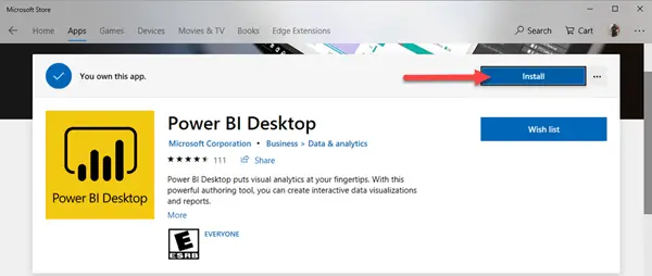
Just click Install, the app downloads, and a bit of time you’re ready to launch!
Windows 10 and 11 Users
IF you are running windows 10 or 11, you can download Power BI Desktop from the Microsoft site. The installation works similar.
Once installed launch, and you’re good-to-go.
Now that we’ve got the software setup, let’s go get some data and create a project.
Step 2 – Get Project Data for Power BI Desktop
For this project we’re going to use some interesting data from the New York City Open Data project – Rat Sightings! We will be working with data from 2010 to present. There are over 120,000 record in the file.
Before we get started with Power BI, let’s create a project folder. I created mine on OneDrive in my Documentfolder. You can create yours where youwish. Regardless when you create it, Ithink it is important to organize your data and Power BI files.
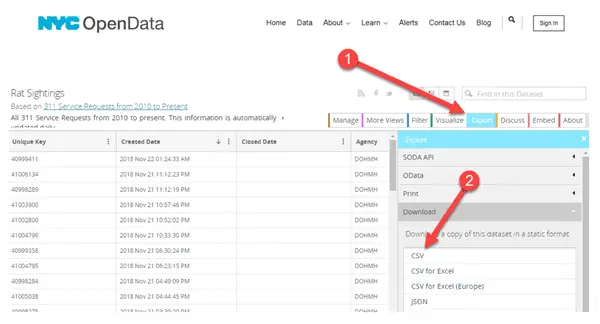
With the folder created, let’s get the data. Go to the NYC Open Data site.
You should be taken directly to the Rat Sighting page. To download the data follow theses instruction as shown on the screen below:
- Click onthe Export tab.
- Select Download and then click CSV to initiate the export.
Once the file has downloaded, copy it to your project folder, for safe keeping.
Step 3 – Load and Model Project Data
Before we get started with power bi let’s launch Power BI desktop. You can find it within windows start menu. If you’re having a hard time finding it, just hit window key and type Power BI.
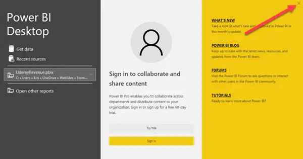
Close the splash screen once it displays:
OK, now we’re ready to rock, let’s get started with power BI and load some data, and get ready to model!
I’ve helped many people get started with Power BI. It is easy!
Power BI desktop is capable of loading data a wide variety of data sources. To get started we’re going to load a text file. For now, we’re just seeing how the tool works together. In future articles, we’ll look at querying SQL.
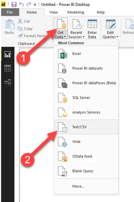
Make sure the Home ribbon showing, then select Get Data and Text/CSV.
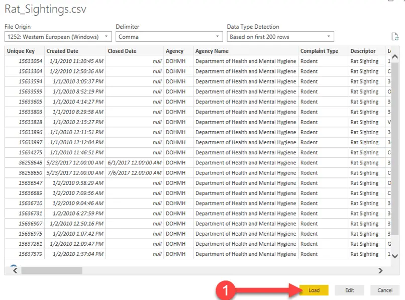
When asked, navigate to your project folder and select the Rat_Sightings.csv file. After a few moments, you’ll see a preview of the file:
For this project we’ll just load the data, so press, you guessed it! Load…
The application determines columns and datatypes based on the first 200 row loaded. It is a pretty good guesser. For our example we don’t need to change anything.
After a couple of moments, the data is loaded. When mine finished there were 2 errors. For now, I choose, to ignore them. In a later blog we’ll look at how to work with cleansing the data and avoid these types of errors.
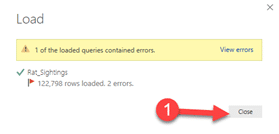
For now, just click Close.
It may not look like much, but you just loaded 122,800, or more, records into your model! Pat yourself on the Back!
Before we get into data visualization let take a brief tour of Power BI.
Power BI Desktop Elements
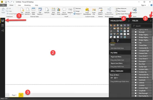
The Report view has five main components, you’ll want to know these when you get started with Power BI:
- The ribbon– displays common tasks associates with reports and visualizations.
- The canvas,this is where you’ll place visualizations.
- The pages tab. Here you’ll be able additional report pages.
- Visualizations panel – displays the visualizations(graphs) you can place on the canvas, as well as the means to customize their colors and fonts.
- Fields panel – Displays query elements. These can be dragged onto visualizations.
Step 4 – Visualize Data using Power BI Desktop
I think adding visualizations to Power BI is the most fun part of the process. Once you have your model set up properly, it really becomes a drag and drop process.
That said, keep in mind modeling is very important, and in this getting started guide, we have barely scratched the surface! In future lessons, we’ll dive deep into modeling.
In this guide, “Get Started with Power BI,” we will add five visualizations to our report:
- Stacked Area Chart – A great way to show comparative trends, such as rat sighting per borough across time.
- Pie Chart – Used to show the proportion of rat sighting amongst boroughs.
- ArcGIS Maps – Interactive map well use to display each rat sighing within New York City’sboroughs according to its latitude and longitude coordinates.
- Slicer – Quick and dirty means to filter data,we’ll select our time scale with it.
- Multi-row Card – provide a convenient means to display textual or numerical data.
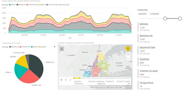
Here is what we’re aiming to create

Let’s get started!
Stacked Area Chart Visualization
The first visualization we’ll add is the stacked area graph.
We’ll use the stacked area chart to show how rat sightings change over time. Each layer or stack of the report will represent a different borough.
Just click on it to add it to the report.
Once it is added let’s set up the visualization.
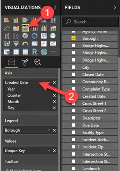
Drag the Created Date field to the Axis well, the Borough to Legend, and Unique Key to Values.
You’ll end up with a chart looking like so:
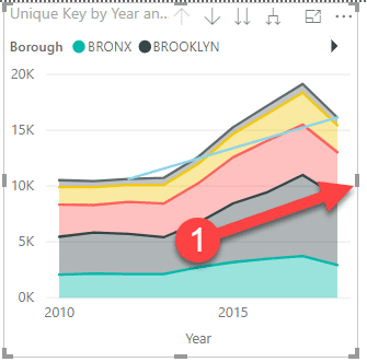
Now grab the center gray bar and drag the chart to the right so it covers three quarters of the width of the report area.
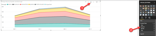
Notice that you can drill into your report. If you click on the double down arrows (1) you can drill into a quarterly view. The dates have been automatically set up into a hierarchy by year, quarter, month, and day.
For our report, we don’t want to see quarterly totals. We can remove it by clicking the x next to Quarter (2).
Before we go further, experiment with the other tools shown in the visualization’s upper right:

Pie Chart Visualization
Lets now add a pie chart visualization. Before we do so, make sure another visualization is not selected. After you have double checked, (1) click on the Pie Chart. Once it is added to the report, (2) resize it so, it is on the left.
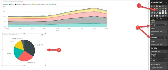
(3) Once it is added, drag the Borough field to Legend, and Values field to Unique Key:
With the pie chart created we can now add a legend. To do this select Format and the click Legend On.
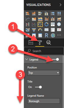
Click on the down arrow to the left of Legend to expose other formatting options: Position and Title.
I would encourage you to explore and try all the settings. You’ll find the visualizations are highly customizable.
ArcGIS Maps for Power BI.
The ArcGIS Maps for Power BI are fun add to a report and explore. This visualization suits itself well when you have latitude and longitudinal data.
We’re in luck, we do!
Let’s add this visualization to our report.
Make sure no other visualization is selected. Once you have double checked, then click on the visualization and it will appear on the report canvas. Now drag it to the right of the pie chart.
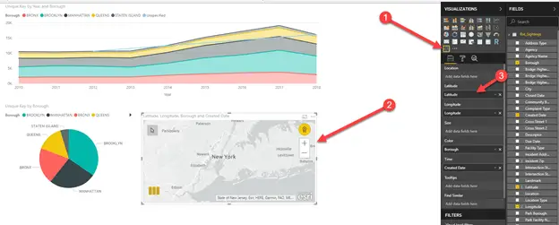
Now drag the following fields to the visualization field wells:
- Latitude -> Latitude
- Longitude -> Longitude
- Borough -> Color
- Created Date -> Time
Once this is done, you’ll notice the map displays the New York area, each dot represents a rat sighting.
Note: In order for this visualization to work you’ll need an online connection.
Slicer
We’re going to add a slicer so we have another way to filter our data. This visualization allows us to set up a nice sliding time scale we can then use to select the time period for rate sightings.
Once you have made sure you haven’t any visualization selected, click on the slicer visualization.
Now move it so it is on the upper right of the report canvas adjacent to the area chart.
Drag now drag Created Date onto the Field well.
You’ll end up with a visualization like this!
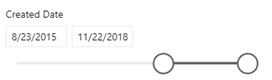
Try moving the slider to select your own time period. Notice how all the other visualization react to your selection and adjust their data. Cool huh?
Multi-row Card
The last visualization we’re going to add is a multi-row card. This is a good visualization when you want to show summary data, such as number of rat sightings for each borough.
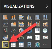
Let get started by selecting the Multi-row card from within the visualization panel
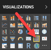
Now drag Borough and Unique Key onto the multi-row card’s Fields well.
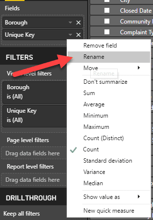
Now right click on Unique Key, and select Rename.
Rename Unique Key to “Rat Sightings.”
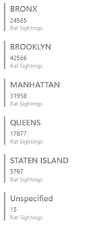
Once you set it up, your multi-row card should look like this:
Get Started with Power BI Desktop – Wrap-up
Once you complete the steps within this article you’ll end up with a Power BI Desktop report like the one shown below.
Keep in mind that we have just scratched the surface! The idea of this article is to get started with Power BI, to show you that its possible to create this report from freely available tools, and that it is easy to do so.
In future articles we’ll dig deeper into data modeling and shaping. In fact we’ll spend most of our time in these areas as this where you can set yourself apart from your peers. If you’re a good modeler, then you can create great reports, and you’ll be in demand.
In the meantime, if you’re not familiar with SQL, I would encourage you to get familiar. You can do so with my Getting Started with SQL page.


Leave a Reply